Improving Web Performance: Lessons and Insights from loveholidays
This is a copy of the post I recently authored and published in medium for loveholidays-tech. Here I talk about some of the work we’ve done regarding performance in the last years. I hope you learn something from it!
(Original publication: link)

At loveholidays we are obsessed about performance; it is not only the right thing to do for our customers, it also gives us an edge in the competitive world of online retail.
A well performing website can attract more visitors, gives customers a better experience, and as a consequence results in more sales. Everyone wins.
However, creating and maintaining a high-performing platform is not easy, especially for larger companies. It’s difficult to justify a big refactor or creating a new platform, and it’s even harder to maintain and improve it over time.
We’ve come a long way in the last 4 years at loveholidays. From having no performance data and serving megabytes of Javascript, to having a lot of visibility, performance checks, and cultural awareness that help us lead the market.
This post expands on several things we implemented and learned when working towards improving the WebVitals performance metrics – user-experience quality signals defined by Google – hoping to inspire you and help you apply them in your organisation.
Justify investing in performance
Making significant refactors in a system (change of frameworks, rebuild big pieces in a leaner way) requires justification since they are often costly. Here are some practical things we found convenient for having that conversation.
Measure yourself
Better performance is good for your business. And this is not only because search engines might rank the site higher; a good performing website contributes to higher conversion rate.
For example, in the following graph we can see that visitors with lower Interaction to Next Paint (INP) have a higher chance to book their next holiday with us.
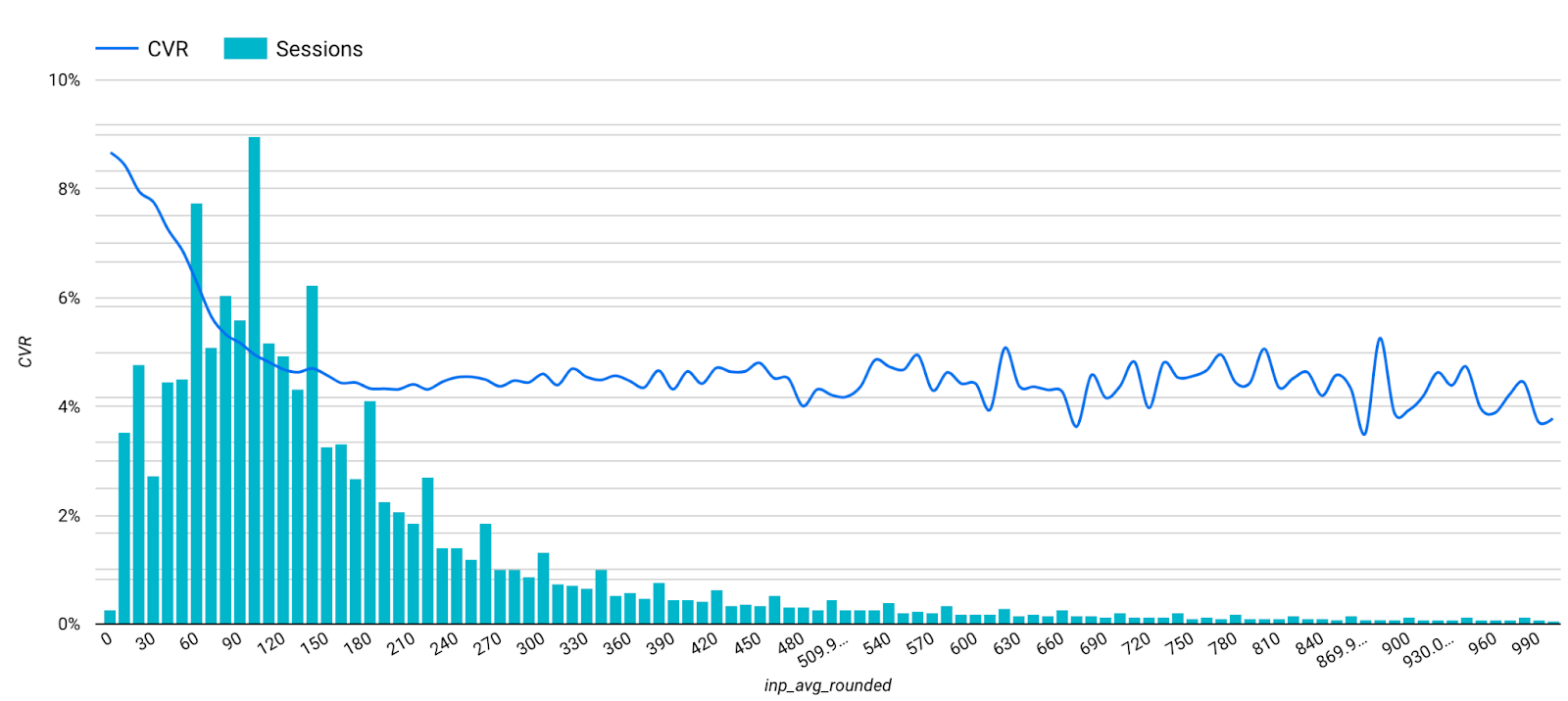
You should consider and collect both Real Using Monitoring (RUM) and Lab (Synthetic) data - they have different possibilities and shortfalls - and use them to show progress and benefits.
Collecting Lab data is fast and simple, and there are multiple ways to do it: using the lighthouse extension in the browser, through WebPageTest, using the command line, etc.
Collecting RUM data - from “real” users, using all kind of devices and browsers - is a bit slower. However, it is a relatively easy thing to do nowadays given the variety of tools available (like Grafana Faro, or SpeedCurve).
In our case, we prefer to collect and own the data for greater control. We use the Google web-vitals library to collect and send real users events through rudderstack to our BigQuery tables for later analysis and to Grafana (via Grafana Agent) for Real Time RUM monitoring. With all the data in BigQuery we create some dashboards (like the one above) and demonstrate how the work done in specific pages/paths improved the Core Web Vitals (CWV) metrics and - some maths after - the revenue.
This was essential for us to prove the impact of our work, and to get the necessary buy-in to tackle bigger and more ambitious re-platforming projects.
We were inspired to create dashboards correlating web-vitals with conversion after this talk in the 2022 performance.now() conference. In his talk, Nic correlated CWV vs bounce-rate, across different kind of websites (visitors behaviour change according to their expectations)
Measure competitors
We also found it useful (and fun!) to benchmark ourselves against our industry peers and see our (and their) evolution over time.
To do this we use the publicly available Google CrUX dataset, which contains RUM WebVitals information collected by Google worldwide since 2017. Despite it not offering too much control (it’s Google Chrome specific, time granularity is 1-month, and it’s filtered per domain rather than a specific path), it helped to keep the internal engagement over time, and to see at a high level how performance correlates to number of visitors and business performance.
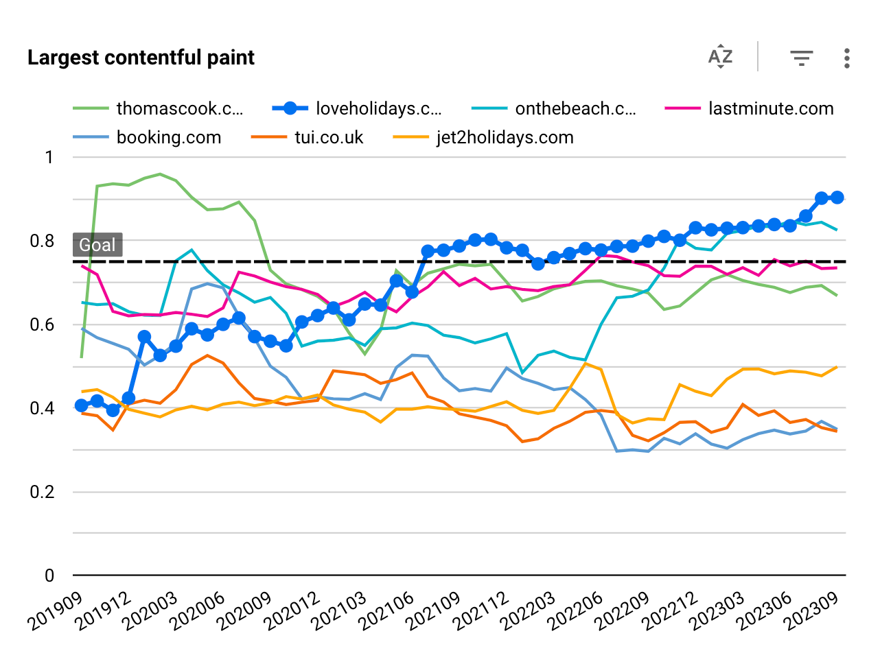
Given that the CrUX dataset is not the easiest nor quickest to handle, we put in place a process that runs monthly to query the latest data and update an internal table for quick and easy dashboarding1.
CrUX is not the only publicly available dataset. We learned about other datasets like rumarchive at the performance.now() last year, and we are looking forward to extracting data from there as well.
Maintain and Improve
Perhaps the hardest part of it all is to maintain the gains - not degrade - and keep on improving them over time. It is hard because it’s not about isolated technical efforts, it also involves a broader cultural change. This section describes a few things we did to make it possible.
Dora’s talk at performance.now() describes the process and the hurdles to sort out when moving from a reactive to a strategic performance centric culture.
Quick and actionable dashboards
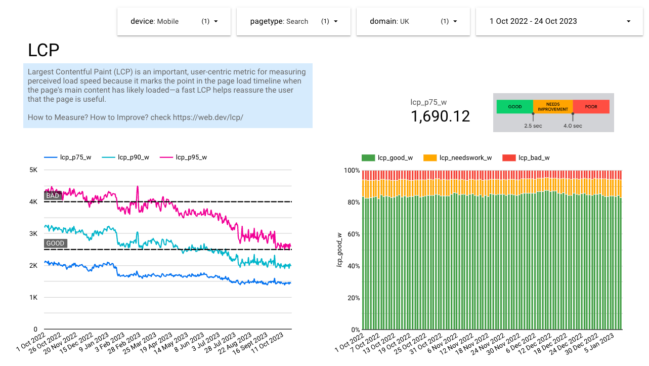
One of the challenges we faced with the RUM data we collected and stored was its size and complexity. It became a very slow and tedious operation to see, for example, how the p75 of the Cumulative Layout Shift (CLS) evolved throughout many months or years. This was simply due to the computed value we needed from a huge amount of raw data we stored in BigQuery.
So we came with a list of things we wanted to see, and designed an intermediate table with precomputed values with daily granularity: p75, p90, and p95 values, how many were categorised as good, needs improvement, or bad, grouped by page-type, device, and point of sale. This gave us significantly faster dashboards to use.
Performance budgets
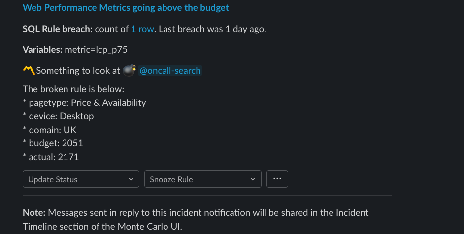
After having the intermediate table for quick dashboards, we added some thresholds (budgets) to specific configurations (page type, device, etc) to receive alerts when any of the metrics degrade. We decided to use Monte Carlo monitors through SQL queries. Upon a breach, we receive alerts in Slack and our engineers will spend time investigating their root cause.
This talk by Tammy in performance.now() was very helpful to decide what thresholds to choose.
Lighthouse on code-changes
An important step was to set up lighthouse-ci to run on every pull-request, and avoid degradations due to code-changes. We don’t allow pull-requests to be merged unless they pass the tight thresholds we set per url.
This is not meant to be a barrier to discourage code changes, but rather an opportunity to mentor our engineers, helping them to identify unhealthy patterns and to figure out more efficient ways to develop features.
Two key aspects to consider when setting lighthouse up are: it should run as predictably as possible, and it should run with the same data every time. This is why we run the process in specific google-cloud machines (instead of random on-demand ones), and with a fully-mocked graphql endpoint (our only data endpoint).

Lighthouse on production website (Lab/Synthetic data)
We also run lighthouse hourly (as a cronjob) for many of our pages (as well as for our competitor’s pages) to detect other kinds of degradations. The main difference with the previous strategy (lighthouse on code-changes) is that here we assess the live website, which contains 3rd party scripts and real data and assets instead of mocks.
This helped us to detect, for example, a significant increase of bytes transferred caused by a seasonal hero image that wasn’t going through our usual image-compression funnel.
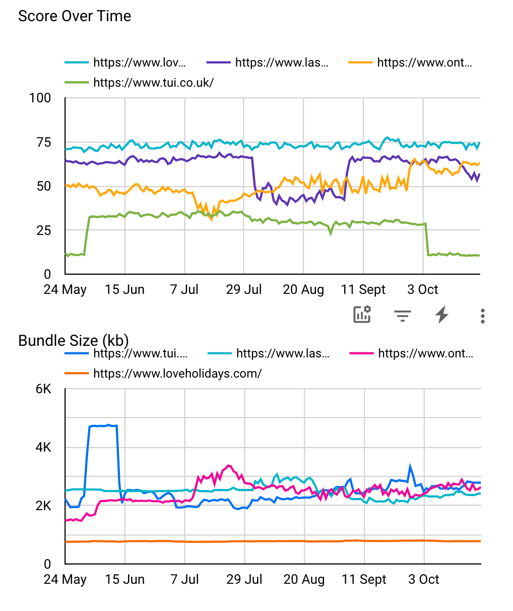
More dashboards: AB Test impact on performance
At loveholidays we ship most features as AB Tests. Although historically we had good reports about their impact in business metrics, like conversion or drop-rate, we were lacking visibility on how they impact performance.
Therefore, we created specific dashboards (using the RUM data collected) to help us understand how each AB Test impacts performance. These dashboards are becoming an invaluable tool for planning their next steps (i.e: optimise the test, bake it in, stop it).
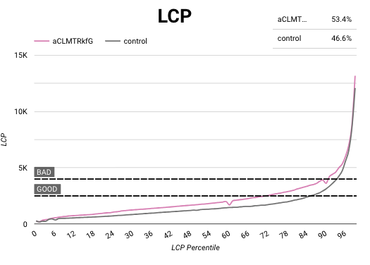
In these dashboards we use the Cumulative Distribution Function (CDF) which were heavily inspired by Katie’s talk in the 2022’s Performance.now() conference. CDF makes dashboards smoother and easier to understand.
Key Takeaways
- Gathering performance data is easy, start doing it today.
- Create snappy and descriptive dashboards, about you and your competitors.
- Set rules, not suggestions. Without them, all gains will be eventually lost.
- Widen the performance conversation as much as possible. It’s not only for engineers.
- Focus on performance also benefits your engineers, making them better.
We are aware that there’s a lot more to do, to learn, and to improve. This is a lifetime journey, and we are curiously looking ahead to what’s next.
Finally, we are sponsoring performance.now() again this year as we think it’s one of the best conferences that talks about experience and performance. If you’re there, come chat to us about this and, by the way, we are hiring.◆
-
To dashboard ourselves and competitors using the Google CrUX dataset, we use Looker connected to Google Sheet that’s filled up with the results of the following SQL query:
WITH competitors AS (
SELECT
  [STRUCT('https://www.loveholidays.com' as origin, 'GB' as point_of_sale),
  STRUCT('https://www.onthebeach.co.uk' as origin, 'GB' as point_of_sale),
  STRUCT('https://www.tui.co.uk' as origin, 'GB' as point_of_sale),
  STRUCT('https://www.jet2holidays.com' as origin, 'GB' as point_of_sale),
  STRUCT('https://www.lastminute.com' as origin, 'GB' as point_of_sale),
  -- ...
  ])
SELECT
  _TABLE_SUFFIX AS yyyymm,
  SUM(lcp.density) AS fast_lcp,
  report.origin,
  compe.point_of_sale,
FROM
  `chrome-ux-report.all.*` report,
  UNNEST(largest_contentful_paint.histogram.bin) AS lcp
JOIN
  (SELECT origin, point_of_sale
   FROM competitors, UNNEST(competitors.origins)) compe
ON report.origin = compe.origin
WHERE lcp.start < 2500
GROUP BY yyyymm, origin, point_of_sale
ORDER BY yyyymm